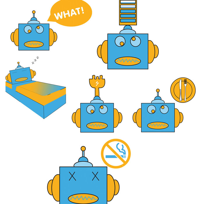
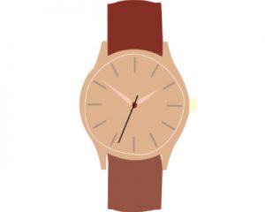
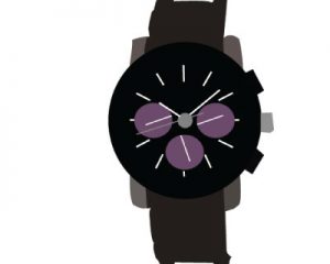
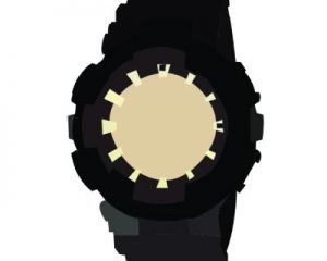
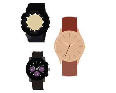
LI BANG PANT WEBSITE

Li Bang Paint website is an international site that is used by people who love art or like to decorate their houses. At the same time, it can be used by specialists who do paint or redecoration work. This site was redesigned because the company felt that there was too much information on the site that needs to be condensed. The newer homepage design displays the important information first. Some features were kept because the original design concept was good. By doing this, it makes it easier for the people to browse and find what they want on the site.

FISH TSHIRT

The fish T-shirt is for people who are interested in fishing, or people who like fish in general and also Fish lovers. The design is done with an ocean background so it can make the audience feel that they are underwater swimming with the fish. This design is laid out that way because it makes buyers feel that the fish is swimming when they are wearing it. This shirt is not geeky but stylish.

BBT WEB BANNER

              The Bubble Tea “BBT Design” is for people that like BBT or people who are interested in trying new things. It is a bunch of web banners that could be used on their website. By making the design in a clean and unique way, it allows the viewers that are looking at the site to have an easier time to understand clearly what the BBT store sells. By designing it this way, it can make the viewers have a better idea of what the restaurant sells and also it can interest them to go to the actual restaurant.


ILLUSTRATIONS

        These illustrations are for people who are into illustrations, character drawings, or even art in general. The illustrations are drawn in an illustrative way with a black outline, so it can show more clearly to the audience to allow them to understand the drawing much easier. At the same time, they are all drawn with an optimistic feel because the designer likes to make people feel happy while they are looking at the drawing. All the illustrations are done with a bright color because it makes people feel happy and vibrant.

THEATRE UNDER THE STARS

          These designs are used by Theatre Under The Stars, inside Stanley Park in Vancouver. The VIP Experience ads are done in an illustrative way with balloons, to show the viewers they will have a thrilling experience while they are at the theatre. The colors are chosen that way to make the viewers inside the theatre feel that they will have a happy experience throughout the whole show. The Annual Fall Gala and Plant your Roots with Tuts ads are done in a magazine ads format, with a clear font. Some fonts are bigger because it shows the viewers when they are viewing the show magazine, which is where this design will be placed. It is in a clearer way so they can find what time the event is happening and what they want to see. The tree pictures are chosen because the shows will be shown at the end of summer near the fall.  The Garden Cafe and Washroom signs are chosen with a bird logo on a tree branch arrow because it is easier for the audiences to find these places. Usually, when we think of birds, they are usually always standing on tree branches, so that is where the inspiration comes from. At the same time, it is designed with the white and black background because those are the theme colors of Theatre Under The Stars. 

LIFE STORY

   The Life Story illustrations are for people who are interested in illustrations or artwork. This original idea is supposed to be a person in the washroom singing while showering. This is drawn to let people feel that the character is in the washroom. The green and brown drawing on the left side at the bottom are bath products. The colors are bright and colorful to let the viewers feel that the designer is living an optimistic life. At the same time the flower, tree, and sun are portraying the same feeling.

BEAUTY BLENZ

          Beauty Blenz is a company that sells powders that make people stay young and healthy. The logo is for people who like Beauty or like to stay young no matter what age they are. It is done in romantic cursive fonts to let viewers have a feeling that they can be beautiful no matter the age, as long as they use the right beauty product. The pink colors are chosen to portray a girly and pretty look. This can be used in any material, magazine, shop logos, signs and more. Viewers will hopefully look at this and want to stay young and take care of their beauty.

ROBOT STICKER CREATION


The Robot sticker is aimed for people who like to download stickers on their Line app, and also people who like to decorate. This design is aimed around my own logo because the original idea was to make and upload it to the Line site to see whether people will download it or not. The colors are bright for the design because it shows a happy mood. Each of the designs expresses a different mood and feeling to the viewers who are using the stickers. The design can be for anyone no matter the age or gender.


BIKER

The Biker design t-shirt is aimed for people who like bikes and people that like to cycle. This design is clean and sleek, also it has a modern and fashionable look. The color theme gives an international feel so it makes the t-shirt expensive yet affordable. The important part is that the t-shirt is unisex so it can be for male and female.

SKULL

The Skull design t-shirt is aimed for people who like things that have a skull theme, and it can also be for people who like punk rock music. The design is clean and sleek. The colors are done in blue, purple and red because it shows a differentiation from others because normally, people choose to use colors that resemble the skull. The design can be put onto a white and black t-shirt, but black would be the preferable choice because it can help the design to stand out. The important part is that the t-shirt is unisex so it can be for male and female.

VIP ADS


The VIP ads are targeted towards car lovers and people that want discounts towards fixing their cars. The ads are designed with a VIP card to show that there is a card that will give you a discount when you fix your car. There is a truck in the ad to symbolize to the target audience that the card is towards the vehicle maintenance. The poster ad has poster stands in the design to show how it would look when it is displayed. The background of the design has some shadow and gradient, which makes the car stand out more. At the same time, the blue color is chosen to give a sleek design, so that when the target audience sees the poster displayed outside, it will catch their attention. Overall, the ad makes the target audience feel that the company has a good team that gives great deals to their customers to fix their cars.


COOL POSE

This Cool Pose design is aimed for people who are interested in observing how other people draw individuals. This design is aimed at cool guys because the original idea was to get a random celebrity. The colors are done in black and yellow to make it look fashionable. The design is targeted for celebrity lovers.

ON TREND

The On Trend design is aimed for people who are interested in observing how other people draw individuals. This design is aimed at cool guys because the original idea was to get a random celebrity. The colors are done in dark color because to show a trend. The design is targeted for people who love to be trendy and are always in the know of trends.  

NO RAMEN NO LIFE


No Ramen No Life is a design that is aimed for people who like to go to G Men ramen or for people who like to eat Ramen.                                                                                                                  

The design is for website’s homepage animation. The design idea is based on a person who is skydiving while he is in the air he is eating G Men ramen at the same time. While he is skydiving, his food accidentally falls to the floor. The background uses Vancouver’s famous spots because it is trying to send a message to the audience that no matter where you are in Vancouver, you will always want to go and eat G Men ramen. The colors chosen are more colorful and bright because it resembles a happy mood while eating G Men ramen. Overall, this design gives you the message that when you eat G Men ramen, it can bring happy memories.

AVENGER BOT

The Avengers Robot design is designed to look similar to the Iron Man concept.  The design is targeted towards people who are interested in robots or particularly with the Avengers. The colors that are chosen are Iron Man color themes in order to resemble the character. By doing so, people can relate to the Iron Man theme when they look at the robot design. The additional parts in the design is the blue circle in the middle of the chest, which also relates to the Iron Man theme.


BUTTER-FLY AWAY!

The t-shirt was designed with butterflies, by using the pen tool to draw many different butterflies. The placing of the butterflies is done this way because it symbolizes happiness and makes the viewers see that each butterfly is ready to fly off into different directions. At the same time, it gives viewers the sense of depth. The smaller butterflies are further in distance and the bigger ones are to show that they are closer. This gives a sense of which one is more important to see first and which one to see after.


DON’T SWEAT DA TECHNIQUE

Don’t Sweat Da Technique is a Vancouver-based street dance competition that is hosted every year and sponsored by Groovy Gentlemen dance group and other dancers. This competition is aimed for people from any age to enter. This is the place for you to come and show off your own dance style as well as your own skills. You will be competing with different dancers that have different dance styles from the same category that you have chosen to compete in. The main point of this event is to make sure that you have fun and dance to the best. So please sweat while you dance because it does not matter if you win or lose, as long as you have tried your best. Everybody’s dance technique is different. Stay calm and sweat while you dance. The floor texture on top of the poster is supposed to give you a floor feeling and can also remind people of the dance floor at the competition. The text is done that way to match the floor texture and the red bar across the text is to give the feeling that anybody can feel victorious no matter whether you won or lost. Have fun and dance till you sweat.


LOOKBOOK

Chocoolate is a Hong Kong based company which sells several different products such as shirts, bags, and accessories. The products are cheap, good quality and are designed specifically for young and middle-aged adults who like the style. The name of the company is very different because it is spelled “Chocoolate”, with two “O’s.” This was created to indicate how “they are different”. The design of the catalog is done in a checkerboard format because it is the same as the architecture of the shop; this helps the target audience make a reference as well as remember or recognize the shop and the brand quicker. The products are also strategically placed in the white squares in order to make the product stand out.


THE TONE INC.

This stationery is aimed at audiences who like to listen to music most of the time as well as anywhere they go. The design is done in three color tones so it won’t confuse the audience. The logo is done with the radio character, which makes the people think that it’s called “Radio Man” because it fits with the fun aspects of the shoe. Also, it makes music lovers understand that you can plug your headphone to the shoe and there is a button on the side of the shoe to make it play and pause. The logo is done in two colors (color vs. black and white) with the idea that this product can be used for both commercial and print ad purposes. The audience might like to keep the business card because it can be used for both purposes. It is also designed in a way that the business card can be used for information as well as be used as an apparatus for wrapping your headphone around.


ROCK BAND ICON

Rock Band Icon is a shirt designed with a guitar and circle shaped logo that is mainly targeted for young people who are rock band lovers. Bright colors are chosen as the color theme to show the feeling and passion of rock music. By playing with the lines on the guitar, it can be portrayed in a certain way so that it can cater to both the audience and the designer’s perspective. The use of multiple guitars and symbols is to relate back to the original designer, yet with a new refreshing concept.


EVENT POSTER

 The Jabbawockeez poster is an event poster that originated from talent shows such as ABDC, American Idol, and America’s Got Talent. The characters of Jabbawockeez are done in red and black so the target audience will relate it back to the original Jabbawockeez design. The background for these posters is done in a trippy way so it will make the target audience think back to the concept of the Prism show that they are hosting at the moment. The target audience that will like to buy these posters are dancers and people who like to watch people dance or people who like to see talent shows.


FLUEVOG CREATIVE

 Fluevog is a Vancouver-based shoe company that focuses on unique designs for a hip and unusual audience. Described through their slogan as “unique soles for unique souls”, it is a brand that promises to attack attention to your feet! Every few months, the company will ask their fan base to help design advertising for the next new shoe. The competition engages the creativity from their creative audience. This illustrative shoe shown here is the LoPro Leon, a new high top design from 2014. The light tone of the overall color scheme references the actual colors of the shoe itself. The radio, with the shoe, implies a rhythm for dancing that will attract a creative person by inviting them to “dance to the beat of their own shoes”.


BEETHOVEN – MEMORY OF MY FATHER

This is a book cover for the biography of Beethoven. The target audience that would be interested in the book will be music lovers. The book is written by George Alexander, who dedicates it to his father. The piano and the chair represents the presence of Beethoven because he died while composing his music scores. The piano has two colors, black and brown, to symbolize the period that he was living in at the time. The background is done with dark and lighter red tones to match his time period and also to represent his death. The style of the book cover is done in a Renaissance style together with International style.


BEARD PAPA PACKING

The Beard Papa packaging is a project which we designed. It originates from its mother company in Japan. Upon expanding to North America, Beard Papa opened some stores in Vancouver, BC. Beard Papa is a dessert company that makes a memorable cream puff to the customer. The logo of the packaging is actually made to match the theme of a cream puff, where the yellow is the custard. The packaging contains Halloween, Christmas, and everyday use. For all the packaging, the type and font are chosen to match the creamy feel. The design of the packaging was done through web research, as well as through the Beard Papa website. The bright colors of the packaging are chosen so that the customers have a special and appetizing feeling. The design of the box is kept the same as the original. The audience would generally be Japanese as well as younger North American dessert lovers.


THE BOMB !


The original idea takes from the Jagermeister drink, the “Jagerbomb”. The secondary idea was then to combine the concept of this drink and then package it like a mine bomb. In order to do this, a Jägermeister bottle was drawn with a simple hand drawn and trace technique, and then the label was created. The label has an “explosion effect” as the logo for The Bomb Project. Other aspects in the dial are the timer, the cap, and the pump so it can represent the feeling of the mine bomb just like the old days. Real materials like wood and straw are included into this Bomb Project. The color selected is an army green in order to match the theme of the product. The final step is to cushion the box and product with straw and then a shot glass is placed into the box for final touches. This can then be presented to the Jagermeister as a secondary product concept for them to use in order to promote their product.